Discount upto 50%
A control chart is a mechanism to understand process behavior, predictability, and stability over time. We do know that any process has a certain amount of natural variability. But, how can we tell if the process’s variability has gone “out of control”?
A control chart is a tool used in “Quality Control” for inferring an unplanned change has taken place in a process. A process continuous variable X measures it. Example process variable could be but not limited to, like –
We usually develop Control Charts for processes –
A repeatable process is one in which process do the same thing in the same way and produces the same results.
As per the PMBOK® Guide Control Chart is :-
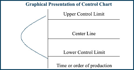
A control chart has the following components:
For repetitive process, the control limits are generally set at +_ 3 sigma around a process. Variable X or process mean i.e. Centre Line. The upper control limit is drawn at 3 standard deviations above the process mean, and lower control is drawn at 3 standard deviations below the center line, or process mean.
We establish these limits to predict if the process needs corrective action to bring process performance in line with needed stability and capability. Analysis of data points with the center line and control limits help us to prevent unnatural process performance with time. Control limits are more stringent from Specification Limits. So that we can take corrective actions before data points start to reach towards specification limit.
Graphical representation of Control Chart Components:

How to determine process is “In Control” or “Out of control”:
We take samples of data points as process output and plot over the control chart. And, then we perform analysis about how we can present these data with respect to the –
Center line and upper & lower control limit. Emphasis is to understand whether data points are within acceptable limits.
Data points within +- 3 sigma are “in Control”, and within acceptable limits excluding the rule of seven (described later). Data points are within +-3 sigma means these data points are not crossing either of control limit. Anything beyond the control limit requires investigation.
Now, come to the – What is rule of seven in project management?
When seven consecutive data points come on either side of the mean –
Then we take this process Out of Control based on the heuristic of Rule of Seven.
In this case although data points are not crossing control limits but as repetitive process is not generating random output –
This may be signal of problem in a process. Efforts are put to understand the situation and root of process problem.
In short, Process is considered out of control –
We need to investigate both of special cause variance.
Development of Control Chart:
As I mentioned earlier that control charts are used to show whether a repetitive process is –
I am taking an example of a process to test repetitive weekly builds. On an average Friday EOD, we need to finish the weekly build. Now we need to understand the acceptable range. Observations state that sometime we get late by 1 or 2 days and someday build gets finish early by a day.
Process Owner may accept Build within one day late or early. But how we can say mathematically that –
The control chart is used to understand mathematic identification of control limits and the need for corrective action.
Suppose we have collected 30 weeks of data to understand whether process output is within acceptable limits.

Now we need to calculate the average of slippage in build for 30 weeks: Average of slippage of data points in days, i.e., 0.73 days.
Now Standard deviation is calculated. Standard deviation means how much variation from the average:

σ = the standard deviation
x = each value in the population
x̄ = the mean of the values
N = the number of values
Using above formula standard deviation will be 5.132273364.
To get control limits, we need to multiply the standard deviation with 3. In this case, the three sigma value will be 15.39682009.
Now it is time to calculate upper and lower control limit:
Upper control limit will be addition of 3 Sigma and average slippage in weeks i.e. addition of 15.39682009 and 0.73. As a result we will get 16.13 as upper control limit.
Lower control limit will be subtraction of 3 Sigma from average slippage in weeks i.e. subtraction of 15.39682009 from 0.73. As a result we will get -14.66 as lower control limit.
As to summarize:
Here 3 Sigma is equal to 15.39682009, Average mean of slippage in days is 0.73 days, Upper control limit is 16.13, and Lower control limit is -14.66.
Now finally control chart can be developed using 2D line graph plot:

Control chart (x) using mean + 3 sigma and mean – 3 sigma control limits
Now we need to analyze charts. There are two data points (two weeks), which are beyond the control limits and that is what we need to do investigation further. As I mentioned earlier that control limit helps us to determine whether or not corrective action is in need. When data points are beyond the control limit, it shows that variability is not natural.
Analysis of standard deviation and control chart states –
We have a poor variation. Here, we need to investigate the root of the problem. And, we can use other tools like “Cause and Effect” diagram, “Pareto Analysis” for the same. After root cause analysis and taking corrective action, we can draw the control chart again. And, finds out whether the variation is reducing with time.
One crucial point is that as we need to remove special cause i.e. two weeks. We may choose a brainstorming tool to understand –
What events held during those two weeks contributing to special cause variation. In agile, we can do this in the Iteration retrospective. In this case, the goal of iteration, retrospective would be to determine what can we do to bring the testing process under control.
What is a control chart used for?
Control Chart is used in “Plan Quality” to understand –
What is needed to make sure that repetitive processes will produce results within acceptable limits?
We design the Process improvement plan accordingly.
Quality policies are refined to get the desired output. And, metrics are defined to measure process performance. Historical records of control charts play an important role in the development of –
Also, we use the Control Chart as a tool and technique during “Control Quality” to understand –
Whether repetitive process producing results within an acceptable range and in a random manner.
If not then investigation needs to be performed to remove special cause variation.
In short, the control chart is a useful tool to understand whether a process is stable with time and producing results within acceptable limits and in a random manner.
I hope this blog has sufficiently answered your all queries related to Control Chart. Good Luck with your PMP® Certification Exam.
You can join the discussion on the same in our Forum. You can also log into our YouTube channel watch the video on the same.
Enroll to our FREE PMP® Certification Introductory Program to learn more about PMP® certification
No Trainings found